
Introduction
Three weeks into grading my first stack of introductory microeconomics midterms, I realized we had a massive problem. I was staring at hundreds of exam papers where students had drawn a tangled spiderweb of lines, shifted supply left when it should have gone right, and left entire axes completely blank. According to a 2023 Every Learner Everywhere report, DFW (D/F/Withdrawal) rates in gateway courses like Principles of Economics can reach 60% in traditional lecture formats. I can confidently tell you that the vast majority of those failing grades come down to one single stumbling block: the graphs.
Struggling with microeconomic graph shifts? You can hire someone to take my class to manage all weekly assignments, or go subject-specific and take my economics class for me.
If you are scrolling through Reddit at 2 AM, overwhelmed by multiple curves shifting simultaneously and convinced you are missing some secret economic intuition, you are not alone. The biggest mistake I see students make is treating economics graphs like flashcards they can just memorize. But here is the truth: relying on visual memory for curve shifts will cause you to completely blank out during a timed, closed-book exam.
In this guide, I will show you exactly how to stop guessing slopes and start translating economic math into visual graphs rapidly. You will learn the 4-step framework to solve any graph problem under pressure, using the intercept method and a foolproof template for tracking shifts. By shifting from passive memorization to an algebra-first approach, you can learn to sketch any multi-shift scenario accurately in under 15 seconds.
What Exactly is an Economics Graph? (And Why You're Overthinking It)
To solve economics graphs effectively, follow these fundamental steps: 1) Label the axes clearly (typically Price on Y, Quantity on X), 2) Identify the curves and their slopes, 3) Determine if the scenario causes a movement along the curve (price change) or a shift of the curve (external factors), and 4) Identify the new equilibrium point intercepts.
At its core, an economics graph is simply a visual representation of a mathematical relationship between two variables, holding everything else constant. Most of the time, we are plotting Price against Quantity to find an equilibrium where buyers and sellers agree.
But why does this matter so much? Because graphing proficiency is a significant positive predictor of course performance, explaining up to 15% of the variance in exam grades, according to E. Cohn and S. Cohn in the American Economic Review. If you can master the visual model, the algebraic problem sets become significantly easier to solve.
Most textbooks stop at showing you the completed diagram, but this is exactly where students get derailed. When you just look at a finished supply and demand graph, it looks like an arbitrary "X". But the nuance lies in the underlying math. As Ballard & Johnson found in their 2004 Michigan State University study, a student's mathematical preparation in basic algebra is the single strongest quantitative predictor of success in introductory economics. You don't need calculus to pass Econ 101. You just need to understand basic linear equations: y = mx + b.
Frankly, most students fail because they try to memorize the final image instead of the mechanism. The demand curve is just a downward-sloping line showing that as price drops, quantity demanded rises. The supply curve is just an upward-sloping line showing that higher prices incentivize more production. When you approach a graph, you must think like an algebraist, not an artist.
The Origin of the Graph (And Why We Still Use It)
To truly understand how to read these diagrams, it helps to know why we draw them this way in the first place. While early economic thinkers discussed supply and demand qualitatively, the mathematical geometry didn't exist until Antoine Augustin Cournot introduced it in 1838. However, it was engineer Fleeming Jenkin who, in 1870, explicitly plotted both the supply and demand curves together on a single coordinate plane to analyze labor markets.
But the graph as you know it today was popularized in 1890 by Alfred Marshall in his textbook, Principles of Economics. Marshall famously used the analogy of a "pair of scissors" to describe the market model. Just as both blades of a pair of scissors are necessary to cut a piece of paper, he argued, both supply and demand are absolutely necessary to determine a market price. You cannot analyze one in a vacuum.
Today, the "Marshallian Cross" remains the bedrock of modern microeconomics. In 2024, approximately 32.4% of AP Microeconomics test-takers scored a 2 or a 1, failing to earn college credit heavily due to an inability to manipulate this very model. The graph has evolved from a theoretical curiosity in the 1800s to the primary gatekeeping mechanism of undergraduate business and social science degrees.
Students need to know this history because it highlights a fundamental truth: the graph is a tool for finding intersection points. Dr. N. Gregory Mankiw, Professor of Economics at Harvard University, notes, "We teach students graphs because they are the easiest way to represent relations between variables. But we often forget that what is intuitive to us can look like a spiderweb of lines to a student who is seeing it for the first time."
I'll be honest—I struggled with this concept too when I was a freshman. But once I realized the graph wasn't a picture to be memorized, but rather a pair of scissors determining a mathematical intersection, everything clicked. In the next section, we will break down exactly how to manipulate those scissors without cutting your own grade in half.
Decoding the Shifts: Movements vs. Complete Curve Shifts
If there is one concept that separates students who merely scrape by with a C from those who ace the midterm, it is understanding the difference between a movement and a shift. A lot of students ask, "How do I know if a curve is shifting or if I am just moving along the existing curve?" Most explanations are vague, but the rule is entirely mathematical: a movement along the curve only happens when the variable on the axis changes (which is almost always Price). A shift happens when an external factor—like income, technology, or preferences—changes, altering the entire mathematical relationship at every single price point.
Think of it like this: if a coffee shop raises the price of a latte, you move along your existing demand curve. You buy less because it's more expensive. But if you lose your job, your entire demand curve shifts inward. You are buying fewer lattes regardless of what the coffee shop charges.
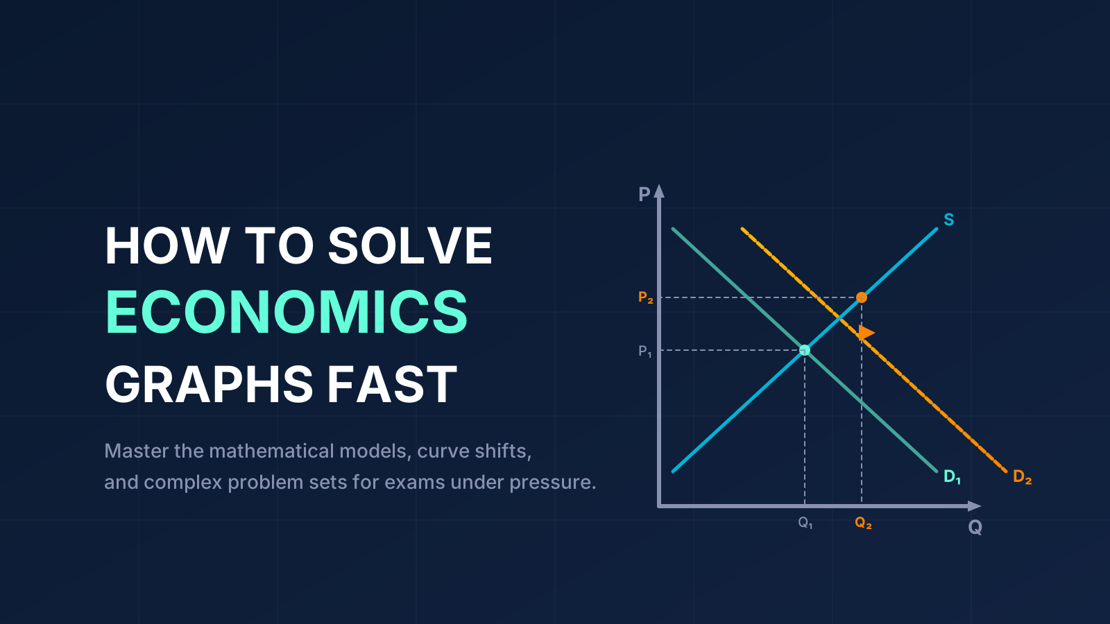
Here is what 14 years of grading has taught me: students panic because they try to memorize lists of "shift factors." Instead, use the Shock-Direction-Result Template. When you encounter a word problem, break it down sequentially. Identify the external shock, determine the direction of the shift, and then plot the resulting new equilibrium.
The Shock-Direction-Result Template in Action
Let's look at a real-world example. During the late 2023 and early 2024 Red Sea shipping crisis, Houthi rebel attacks forced commercial vessels to detour around the Cape of Good Hope. This detour added roughly 14 days to transit times, significantly increasing fuel consumption and insurance premiums for global shipping companies.
- Shock: Increased transportation costs for suppliers.
- Direction: Negative Supply Shock (Supply curve shifts Left/Inward).
- Result: Equilibrium Price rises, Equilibrium Quantity falls.
| Aspect | Movement Along Curve | Shift of the Curve |
|---|---|---|
| Key Focus | Price changes affecting quantity | External variables changing the entire market |
| Trigger | A change in the Y-axis variable (Price) | A change in income, tastes, tech, or input costs |
| Visual Result | Sliding up or down the same line | Drawing a completely new line (left or right) |
Mastering Supply and Demand Under Pressure
When the exam clock is ticking, the classic supply and demand equilibrium can suddenly look like a tangled mess, especially when a professor throws a "double shift" at you. A common question I hear during office hours is, "Why does the supply curve shift to the right when production costs decrease?" Students often confuse "right/left" with "up/down."
To answer that, you have to look at it through the lens of producers. If production costs drop, suppliers can afford to produce more units at any given price point. Therefore, the quantity supplied increases across the board, physically moving the entire line outward (to the right) on the X-axis.
But what happens when both curves shift at once? Take the 2023-2024 artificial intelligence boom. The sudden integration of AI created a massive positive demand shock for high-performance GPUs, like those from NVIDIA. Simultaneously, let's pretend a breakthrough in silicon manufacturing caused a positive supply shock.
Handling the Dreaded Double Shift
When both Demand and Supply shift to the right, Quantity definitively increases. But Price? Demand shifting right pushes price up, while Supply shifting right pushes price down. Without specific magnitudes, the change in Price is indeterminate.
Grading Pitfalls: Easy Points You Can't Afford to Lose
There is nothing more frustrating for a professor than grading an exam where the student clearly understood the economic intuition but failed to format the graph correctly. According to a landmark study by E. Cohn and S. Cohn in the American Economic Review, graphical proficiency is a significant positive predictor of course performance, explaining up to 15% of the variance in exam grades. That is the difference between a B- and an A.
The textbook says you just need to show the intersection. But in practice, grading rubrics are brutally strict about labeling. If you draw a perfect supply shift but forget to label your new equilibrium price ($P_2$), you are going to lose points.
The Pre-Submission Graphing Checklist
Before you hand in your exam or hit submit on your digital problem set, run your graphs through this checklist:
- Axes Labeled: Price (P) on the vertical Y-axis, Quantity (Q) on the horizontal X-axis.
- Curves Identified: Original curves ($D_1$, $S_1$) and new curves ($D_2$, $S_2$).
- Directional Arrows: Draw a physical arrow pointing from the old curve to the new curve to explicitly show the direction of the shift.
- Equilibrium Trace Lines: Use dotted lines to connect the equilibrium intersection to the axes, clearly marking $P_1$, $P_2$, $Q_1$, and $Q_2$.
How to Actually Practice (And Build Muscle Memory)
Now that you understand the algebra-first method and the Shock-Direction-Result template, here is how to actually apply it before your next exam. The worst thing you can do is just stare at the textbook and nod along. You need to build graphical muscle memory so that when the clock starts, your hand knows what to do even if your brain freezes.
The Blank Diagram Test
Print out a set of completely blank axes. Without looking at your notes, draw the five core microeconomic models: Basic Supply & Demand, Price Floors/Ceilings, Taxes/Subsidies, Perfect Competition (Firm vs. Market), and Monopoly. If you hesitate for more than 10 seconds on where the Marginal Revenue curve sits relative to Demand, you don't know it well enough yet.
Teach-Back the Procedure
Grab a study partner (or a willing roommate). Explain out loud why a specific curve is shifting. If you find yourself saying, "Well, the line just goes this way," stop. Force yourself to explain the economic logic: "The line shifts right because consumer income rose, so they can buy more goods at the exact same price." This spoken articulation solidifies the concept.
When applying this to your weekly problem sets, always sketch a rough graph in the margin before you touch a calculator. It serves as a visual "sanity check" for your algebraic answers. If your math tells you price went down, but your sketch shows an upward shift, you know you dropped a negative sign somewhere.
Common Mistakes (That Will Tank Your Grade)
I spend hours every semester trying to salvage partial credit for students who fall into the same predictable traps. If you want to protect your GPA, watch out for these three specific errors.
1. Misreading the Vocabulary
A staggering amount of lost points comes from confusing technical terms. A student on the r/homeworkhelp subreddit recently complained, "Half the time I draw the wrong shift just because I misread a term like 'marginal cost' or 'average variable cost'." This is incredibly common. The difference between "change in demand" (a shift of the curve) and "change in quantity demanded" (a movement along the curve) is just two words, but confusing them guarantees a zero on the question.
2. The Disconnect Between Math and Visuals
As we discussed earlier, students often see the algebraic equations on problem sets as completely divorced from the graphs they draw in lecture. If you are given $Q_d = 100 - 2P$ and $Q_s = 20 + 2P$, do not just plug numbers randomly. Use the intercept method. Failing to connect the $y = mx + b$ format to the physical lines means you are flying blind.
3. Blanking Out on Multiple Shifts
When an exam question introduces two simultaneous shocks (e.g., "Income rises AND production technology improves"), students panic. They try to resolve both changes mentally before putting pen to paper. Never do this. Shift one curve, draw the new temporary intersection, and then shift the second curve.
Essential Resources to Keep You on Track
You don't have to suffer through an opaque textbook alone. There is a wealth of material out there designed to make these concepts visual and intuitive.
Free Academic Resources
If your assigned reading isn't clicking, OpenStax Economics offers a phenomenal, free, peer-reviewed textbook with highly detailed graphical appendixes. For step-by-step visual breakdowns, Khan Academy's Microeconomics module remains the gold standard for watching curves shift in real-time.
Professional & Data Resources
If you want to see how these theories map to actual career salaries and data, look no further than the government. The U.S. Bureau of Labor Statistics (BLS) is an incredible resource. Not only does it provide raw data you can use to build your own supply and demand charts, but it also proves the value of the degree you are suffering through.
Still drowning in problem sets? We understand that sometimes, despite your best efforts, the workload is simply unmanageable. If you need a lifeline, our expert economics tutors can step in and take your online class for you, ensuring you don't lose your scholarship over a shifting curve.
Conclusion: The Economics Degree is Worth the Graphing Pain
We started this guide talking about the 60% DFW rates that haunt introductory economics courses. You started this article wondering how to memorize all those spiderwebs of lines before your midterm. Now, you have a completely different toolkit.
- You know to use the Intercept Method to anchor your curves with algebra instead of guessing slopes.
- You understand the Shock-Direction-Result Template to handle complex, multi-variable shifts systematically.
- You know exactly how to secure partial credit using the Pre-Submission Checklist to label every axis, curve, and equilibrium point.
- You recognize that a movement is caused by price, while a shift is caused by an external shock.
I know this material is dense, but mastering it pays massive dividends. According to May 2024 data from the BLS, the median annual wage for economists sits at a staggering $115,440. The analytical rigor you are building right now by struggling through these graphs is exactly what employers are paying top dollar for.
Here is your next step: Tonight, pull up your most recent problem set, cover up the answers, and redraw the graphs from scratch using only the intercept method. You've got this.
And remember, if the pressure gets too high, our academic experts are always here to help you cross the finish line.